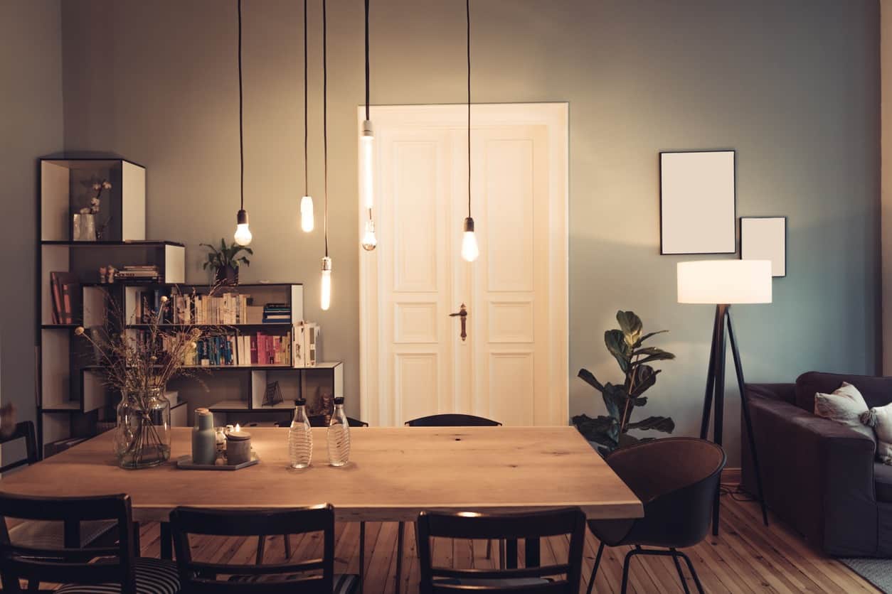
When you’re thinking about updating your home, checking out home decorating websites is a great source for finding the “Ins” and “Outs” and trends in design. For 2019, the pendulum is swinging back towards comfort, color, and personal style; and away from the stark minimalism and cool neutrals that defined the early 2000s.
Any redesign or redecorating is an investment. Choosing classic updates and avoiding anything too trendy are the key elements to an update that increases the overall value of your home, as well as enhancing your quality of life. If you’re really drawn to some trendy touches, go ahead and splurge–just be mindful that those accessories should fall into the “disposable” line items when you’re ready to sell your house, so they can be replaced with something more timeless for photos and showings.
Going forward into the new mid-century, chic is interpreted as cozy, warm, and inviting, with personal style trumping design “rules”.
Living Spaces
Color
Houzz editor Mitchell Parker says that websites like his give homeowners the confidence to experiment with bold colors in their homes. When you see deep, saturated hues in large kitchens, small powder rooms, and every room in between, you realize that rich colors don’t necessarily make your house dark and gloomy. Rather, jewel tones add warmth and a sense of tranquility to your living spaces.
Texture
Textures, and patterns never really went away, but the recent Mid-century movement smoothed a lot of that out in favor of monochromatic tones with small accents for color. Texture is coming back, along with color, and designers are mixing it all up to create warm and inviting rooms that are “lived in” rather than stark and minimalist. Combine suede club chairs with a deeply upholstered linen sofa, a textured rug, large leather ottoman or trunk, and acrylic side tables for a look that is up to the moment on trend and put-your-feet-up comfortable.
Layers
If you despair of clean surfaces and the emphasis of serenity through boredom, you’re in luck. Minimalism is out, maximalism is in, and layering accessories builds on creating texture. Display the things you love on tables and bookshelves, mixing styles and periods and materials. If you’re not using an interior decorator, look to Pinterest and Houzz for inspiration and tips on layering so it’s cohesive and not cluttered.
Florals
These aren’t your grandmother’s fussy roses–these are bold, metallic, and abstract florals in black, gold, and silver–all on the same wallpaper. Cabbage roses on chintz are never out of style, and those are paired with geometric patterns in similar colors.
Dining Rooms
Some homeowners are eschewing a huge remodel by installing glass and metal dividers between rooms–they define the spaces while still allowing visual flow. When they do remodel, many are opting to incorporate a dining room that’s for everyday use, not just formal holidays. Families are rediscovering the advantages of teaching kids how to set the table, and have a technology-free conversation during dinner. These rooms may do double duty as a library or study if space is tight.
Kitchen Trends
When most homeowners start redecorating, the kitchen is usually top of mind–it’s the space where most families spend their time, and where you can expect the greatest return when you sell your house. The key to great kitchen design is custom work–fittings and case goods that are made to fit your exact spaces. If you’re going to hire a professional for any room in your house, make it the kitchen–it’s well worth the investment for expert advice and resources–a countertop corner pantry with swing-out doors, for example, demands expertise to draw and manufacture.
Backsplashes Make A Splash
Kitchen designers are turning the entire space, from countertop to ceiling, into a backsplash feature wall. Bold geometric tiles draw the eye towards that wall, where open shelves are replacing closed cabinets. If you’re not quite ready for a Moroccan vibe in your kitchen, a full wall of tiles, in a subway, herringbone, or chevron pattern, has a more subtle impact.
Custom Cabinets
CAD has made designing truly custom cabinetry affordable, and your kitchen designer can make use of hard to reach corners and maximize your space. Modern cabinet design, with deeper and more accessible drawers, means that you can get away with fewer of them and take advantage of that free space with more windows and a window seat, an office space, or a wine fridge. Cabinet finishes are trending towards a medium-toned wood rather than a dark walnut or a white or lighter stain.
For a little drama, paint or stain the inside of the kitchen drawers–you open those drawers a hundred times a day, so use a color you love for a little pop of happy.
As open shelving replaces some wall cabinets, the remaining cabinetry extends from floor to ceiling with hidden hardware so the entire wall looks like wood paneling.
Custom Island
Islands don’t have to be rectangular–figure out which shape works best for your kitchen layout, traffic flow, and storage. An abstract design offers a nice contrast to the rectangles and squares of most kitchens. Going back to using rich colors, paint the base of the island in a deep teal or marine blue.
Master Bath
Tub Rooms
The second room that has a solid return on your investment is the master bath. The big debate in recent years has been tub vs no tub, as glamour showers have been in vogue, but people who like to take baths are immovable on the tub debate. Free-standing, “destination” tubs are taking pride of place in bathroom renovations, except they’re not in the bathroom–they have a space all their own.
Wood Vanities
Wood vanities are replacing older cabinets. Experiment with woods that are easily sourced, or use reclaimed wood, and finish it with polyurethane, stain, or paint.
Sustainability
As more houses are “green” or “sustainable”–built or remodeled with minimum impact on the environment, and energy efficient–interior design is incorporating more sustainable elements into the home. The most common feature is reclaimed wood–whether for wainscoting, furniture or accessories like mirror frames, but jute, rice paper, and clay are other sustainable materials.
What’s Out In Design
Metallic Fabrics–softer textures with a supple hand are much more inviting.
Monochromatic Theme Houses–Mid-Century design can easily topple over into the strict non-use of any color besides black and white.
Overdone Statement Lighting–geometric, abstract lighting is fine for one or two fixtures, but sensory overload when every light in the house demands your attention.
Theme Art–display the art that you love, not what “matches” your interiors.
Gold Brass–shiny gold brass on every surface, handle, and fitting is too much. As with anything in design, balance and moderation are key.
Statement Upholstery–color should be cohesive and calm, not “pop” out at you. Recover that mustard yellow sofa and awning striped chair in a textured fabric that is integrated with the other furniture in the room. Save the bold color for the walls.
Two-Dimensional Rooms–every room should have some color and texture beyond cool grays and neutrals. Mix up wood colors, fabrics, colors, and styles for a modern look.
The takeaway for updating your home is that it’s yours, and should reflect that at every turn. You and your family want to be comfortable, relaxed, and happy, and that’s really all that matters.

